


 Photo Competition Gallery - May 2026
|
|
|
|
|
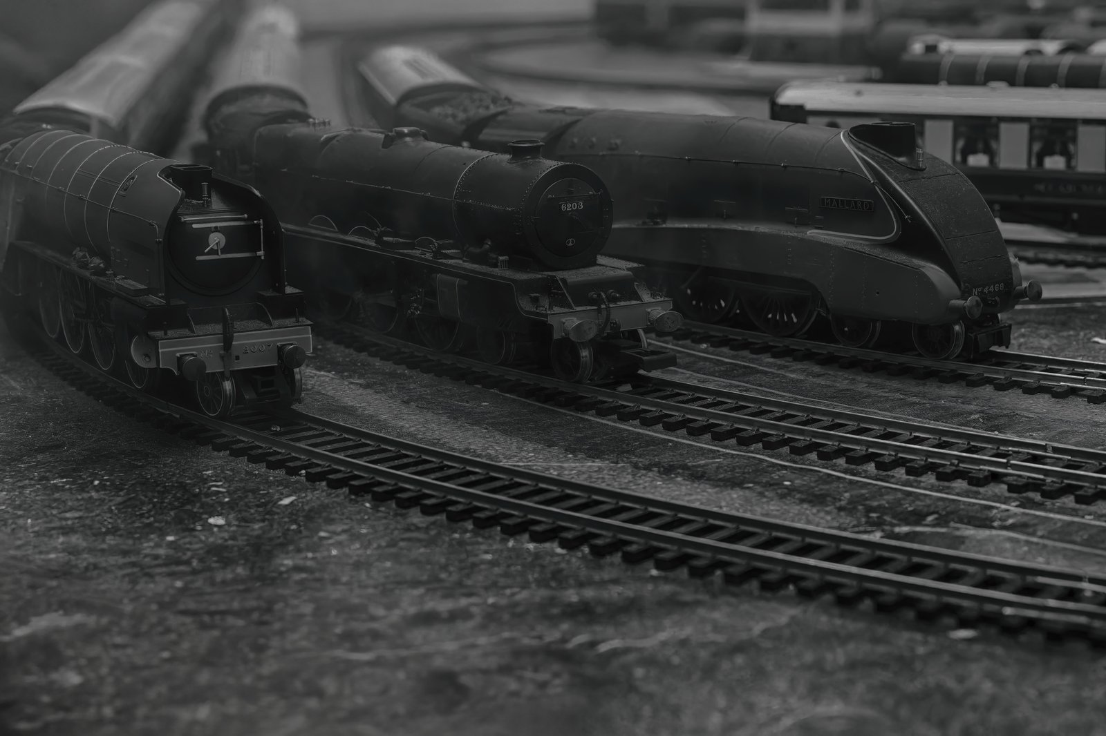
Photo 1 |
Photo 2 |
|
|
|
|
|
|
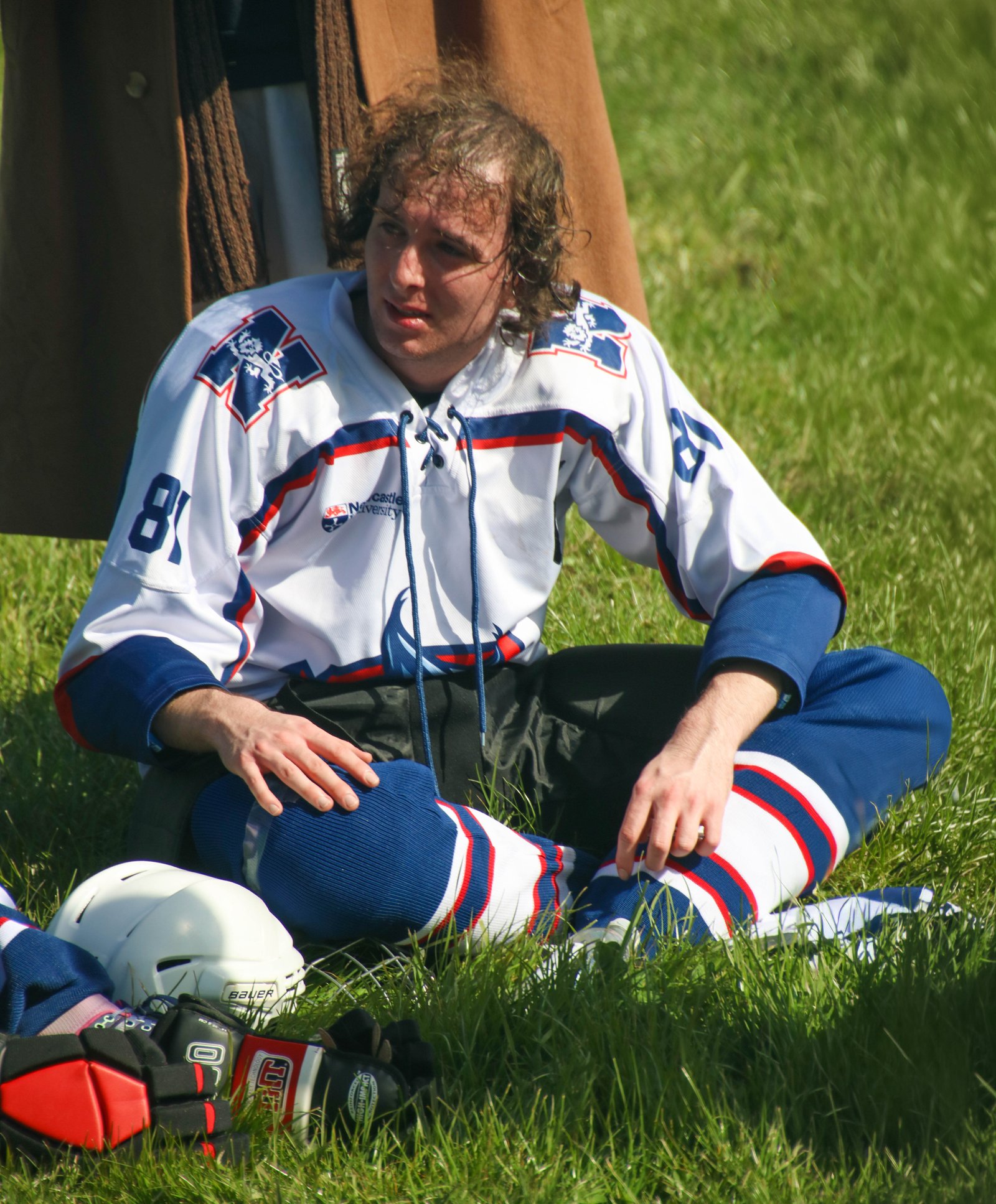
Photo 3 |
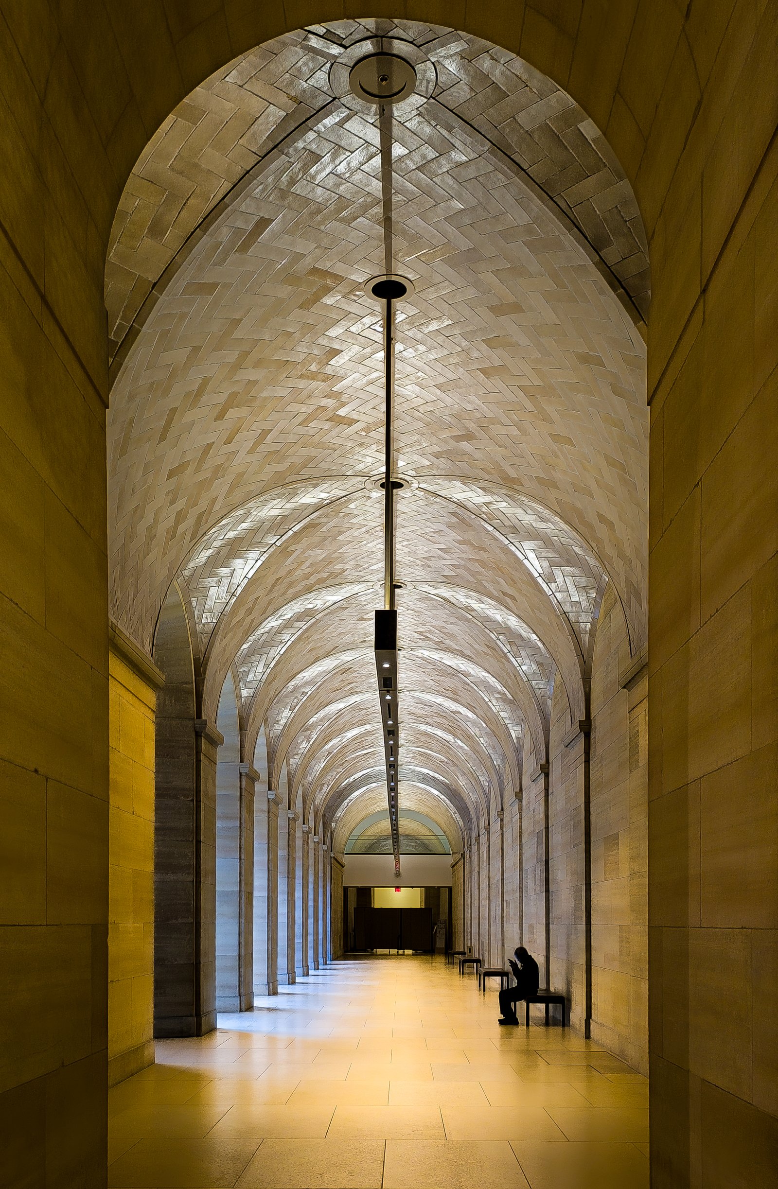
Photo 4 |
|
|
|
Jan's Critique May's Competition This Month's winner is photo Two Congratulations - to Dave
Critique Photo 1 Trains
An interesting shot. Someone has taken a lot of trouble setting this up. The black and white works well - evoking bygone days to a certain extent. The trains snaking in from the left lead towards the rails which flow into the right of the image - this also works in reverse. The carriage (back right) is a little distracting and the photograph might have benefited from some greater definition between dark and light, but overall this is a good photograph.
Photo 2 Leaves
This is a striking photograph. The varied shades of green combined with the silver of the water droplets add vibrancy, and the areas of deep shade provide contrast. Zooming in we can see how sharp the focus is in this shot - a close crop could have made this a stand out image. I always appreciate a full screen image as they can be difficult to achieve and this one works well.
Photo 3 Sportsman
This really picks up the physical exhaustion of the athlete and his anxiety at how the game is progressing. (baseball or American football - I wasn’t sure). As a portrait it works extremely well - the features, the sweat on the forehead and the colours on the uniform are all beautifully captured. Quite an arresting image.
Photo 4 Passageway. Winner.
This is a really beautiful photograph. The composition is excellent - such a good sense of balance helped by including the walls on either side of the entrance. The central line of lighting takes us into the vanishing point and this is duplicated by the ever decreasing size of the arches. The colours are lovely with the light providing natural highlights. What really makes this image is that single seated figure in silhouette. This all comes together to make a stunning picture with just a slight sense of intrigue.
Judge Jan
|
The Winners of the photo Competition are posted on the Winners 2026 Photo Competition page, the rest consigned to ignominious obscurity r |
|
|
|
|
.jpg)
Copyright(c) 2001 Ashley Ferguson. All rights reserved.
ashleyferguson.uk@gmail.com